Heart & Soul
Project: Branding | Year: 2023
/concept;
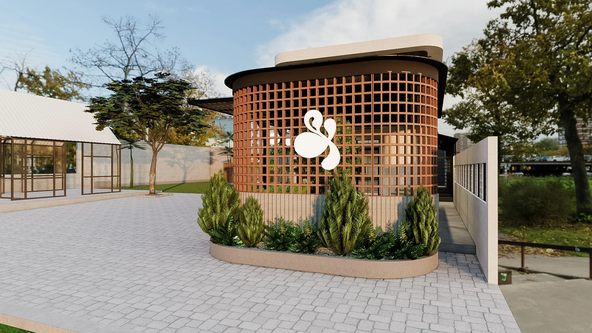
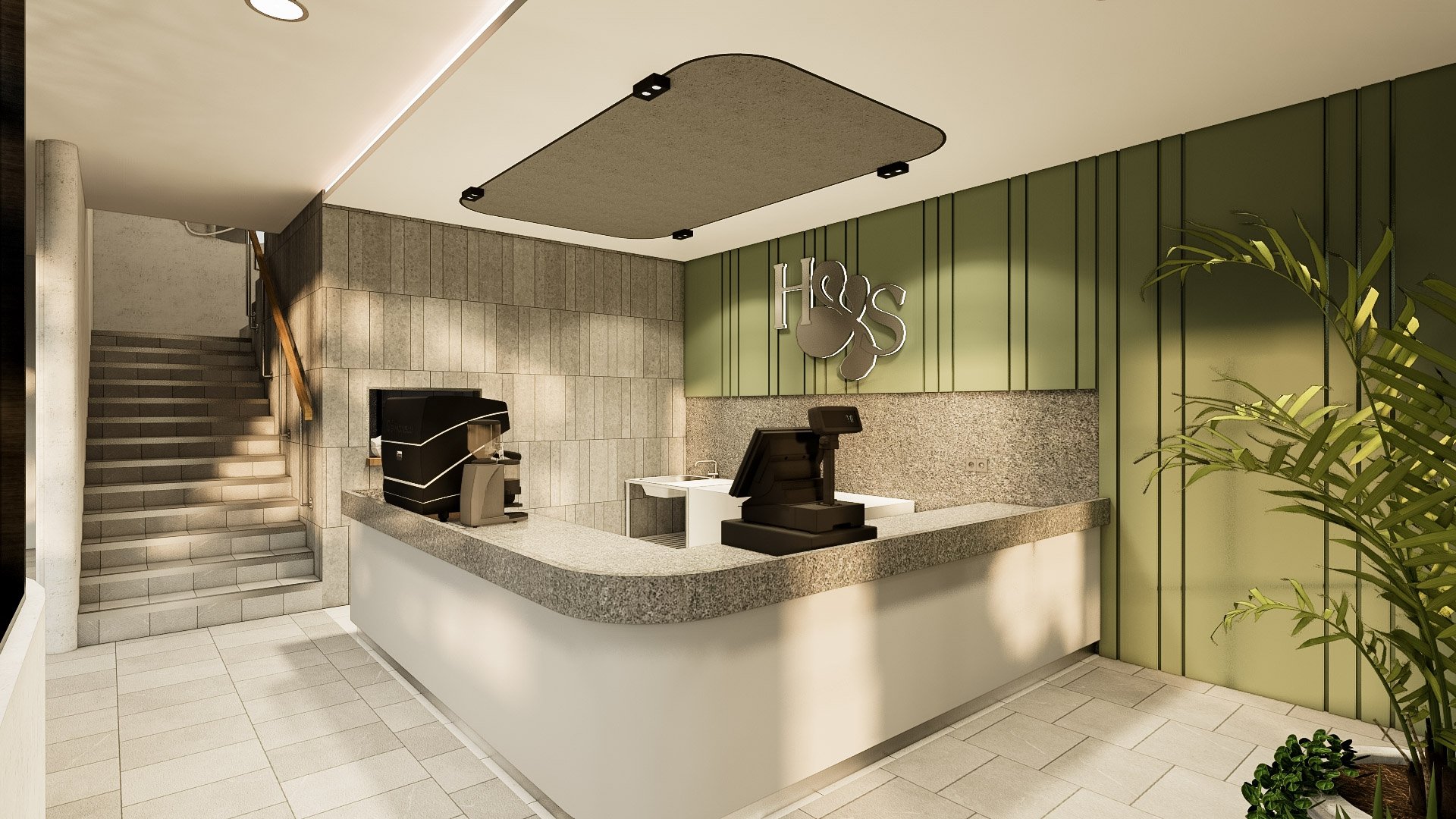
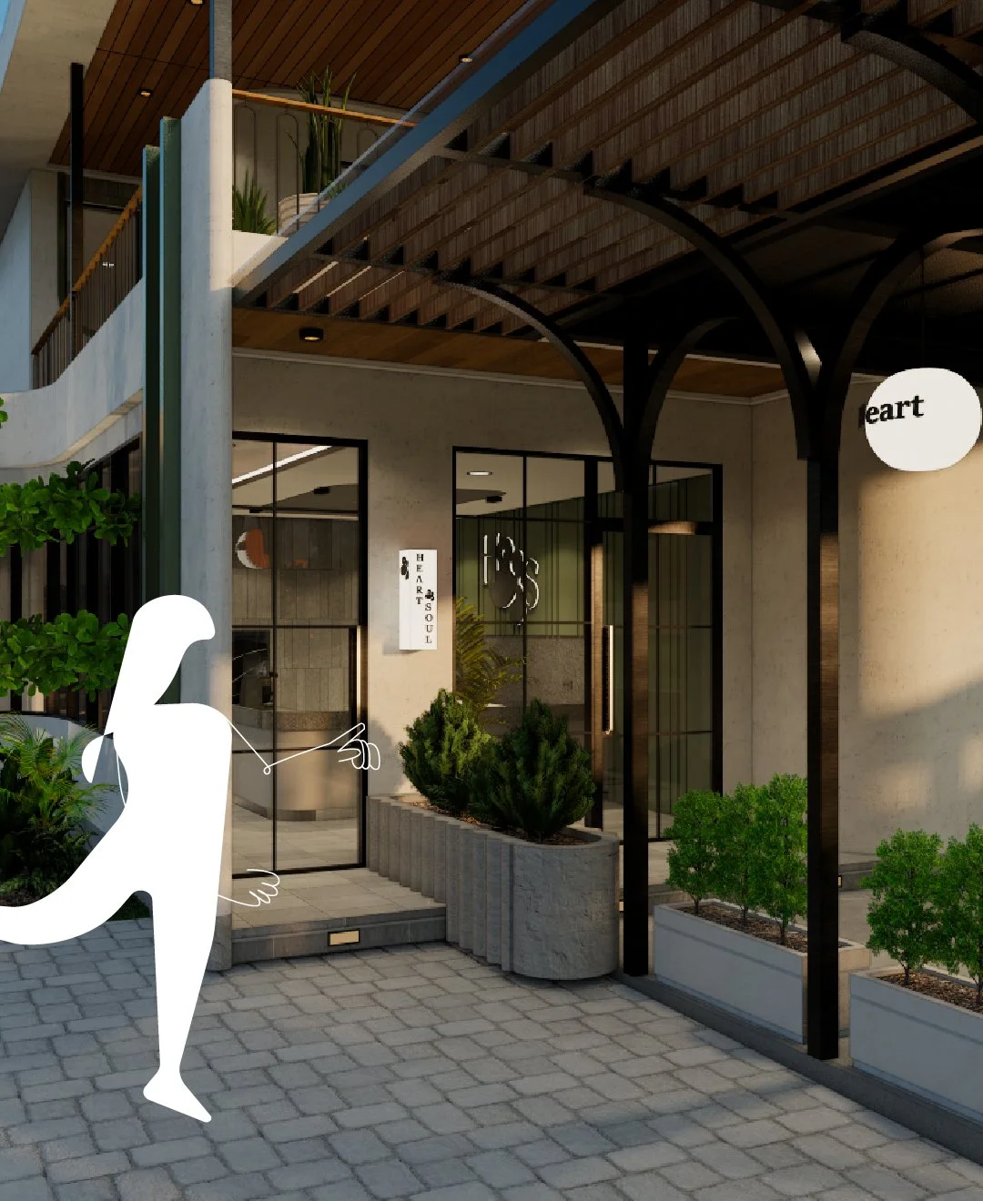
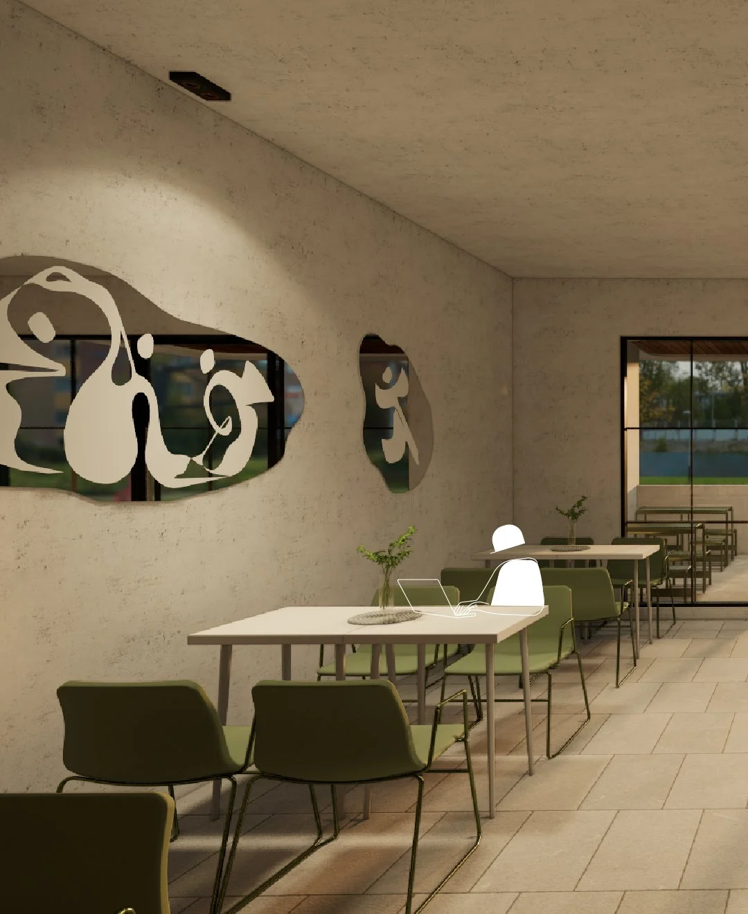
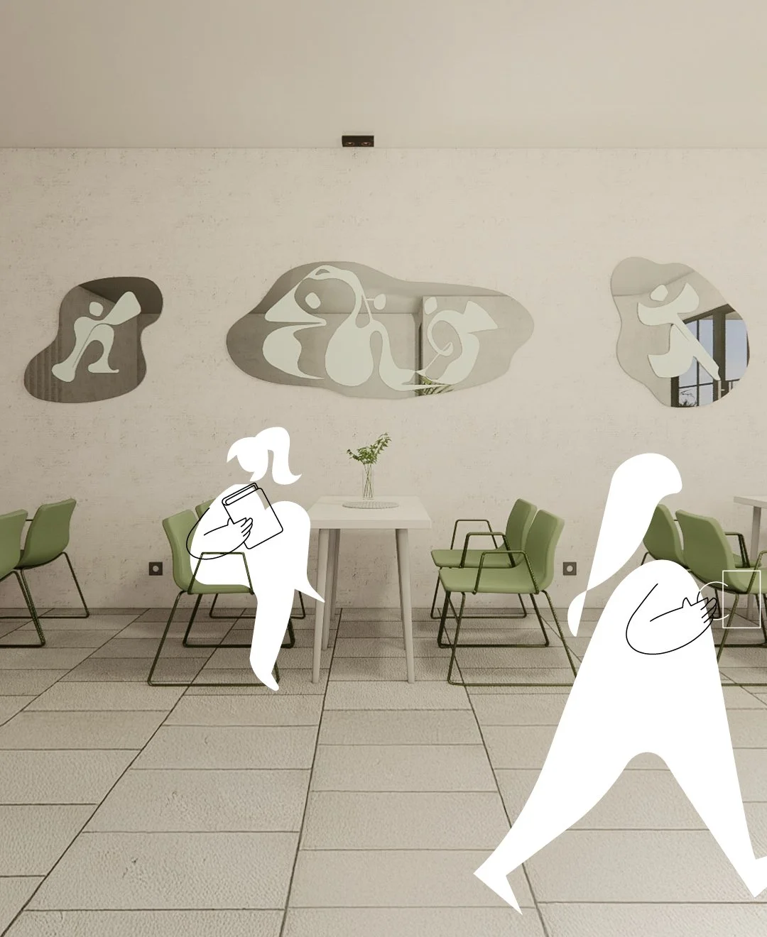
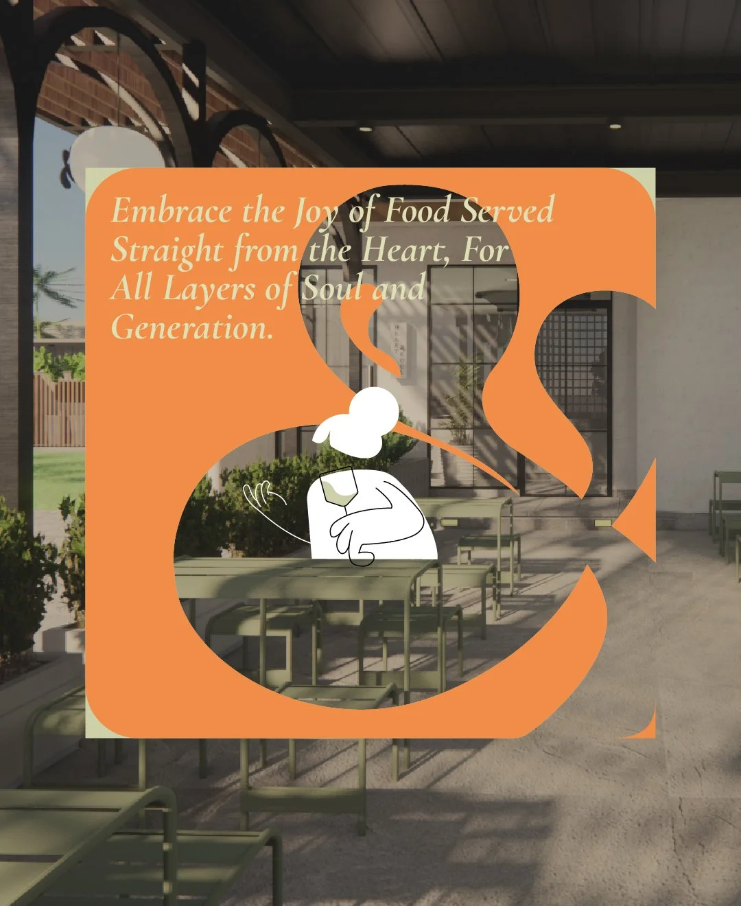
The identity is designed to be minimalist, elegant, and friendly, echoing the architectural character. Built on organic and intentionally imperfect forms, it reflects a sense of ease, freedom, and shared enjoyment.
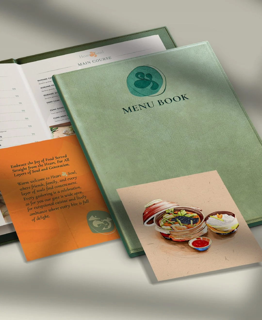
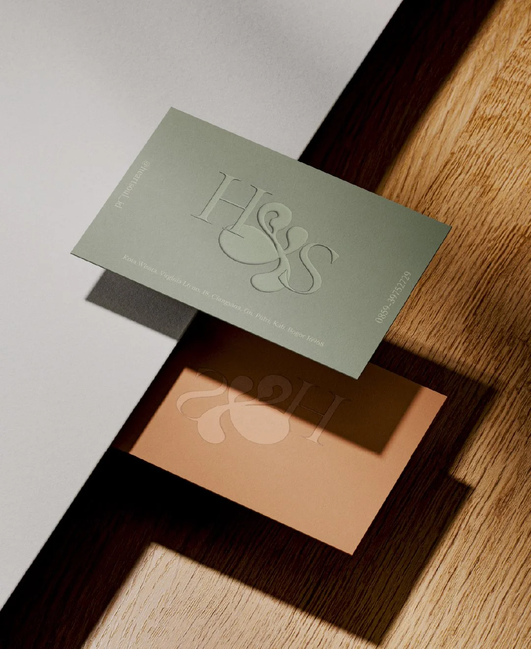
Inspired by beans and natural elements, the visuals avoid rigid alignment and straight lines. The loose graphics express an honest, approachable personality and celebrate the joy of good food and diverse gatherings. The ampersand (&) represents sharing and community, highlighted as the brand icon symbolizing the coming together of two elements. It emphasizes communal bonds and a sense of belonging, where connection and shared experiences create meaningful emotions and lasting pleasure. This reflects what H&S aims to nurture over time.
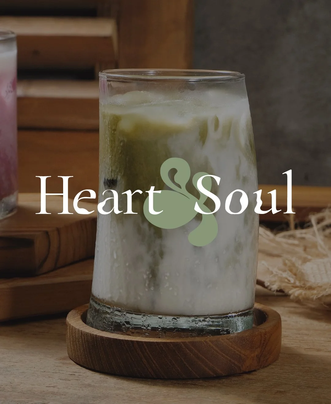

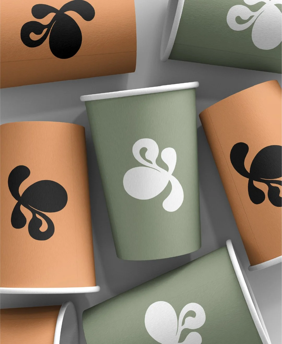
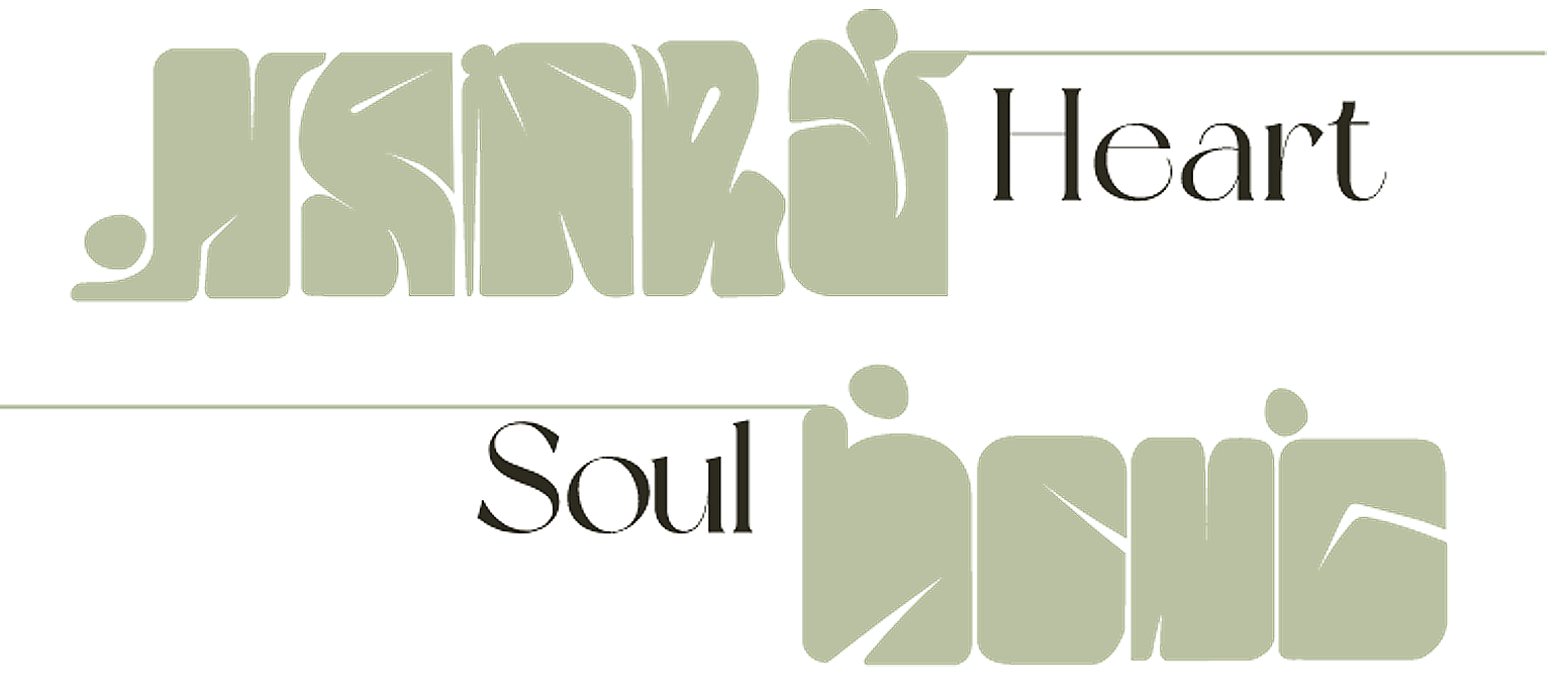
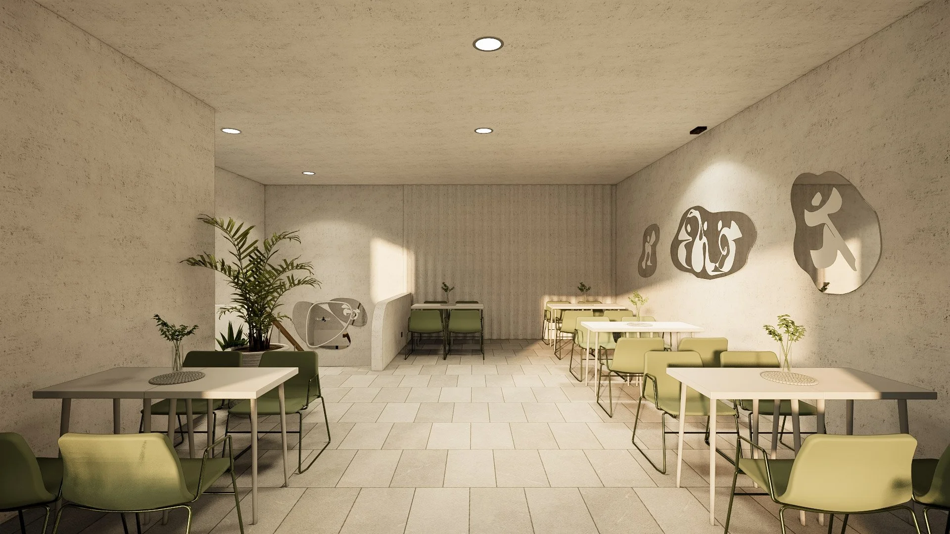
The loose graphic forms applied across collaterals and spatial environments stem from visual explorations of organic shapes arranged in stacked forms, reflecting the architecture. By combining alphabetic heart and soul elements with symbolic forms, a distinctive pictorial style of illustration and graphics is created.