Wisata Essential Oil
Project: Branding | Year: 2021
/concept;
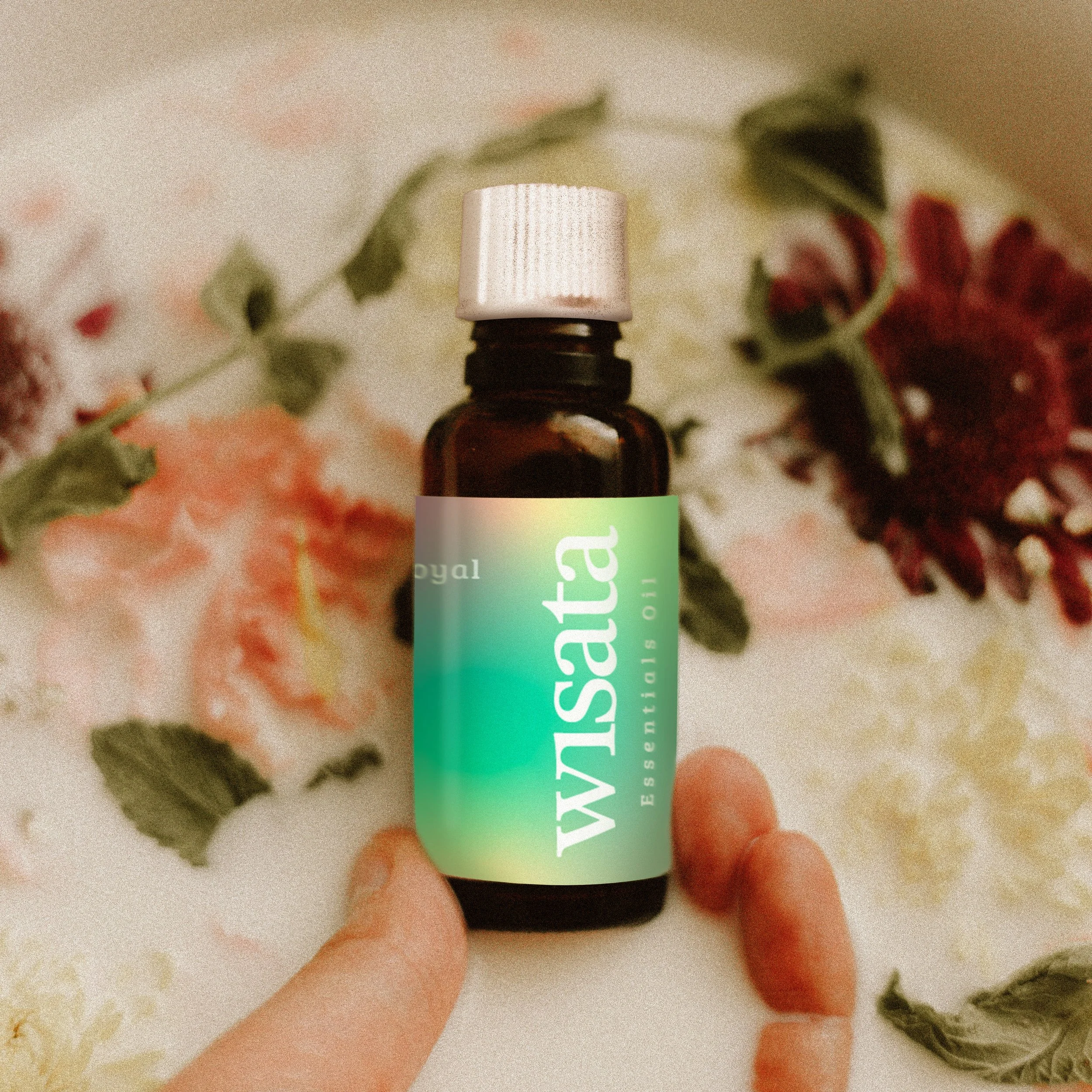
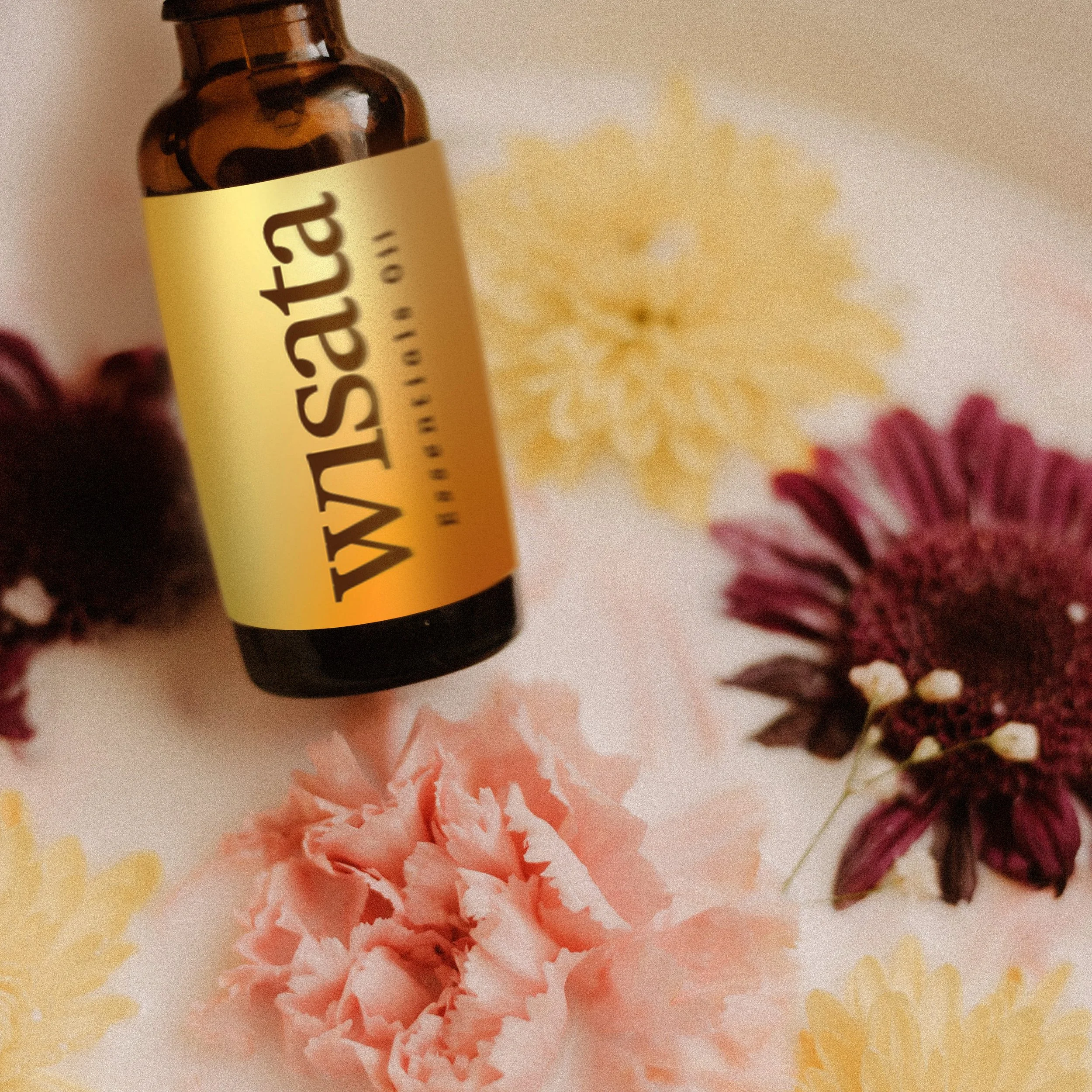
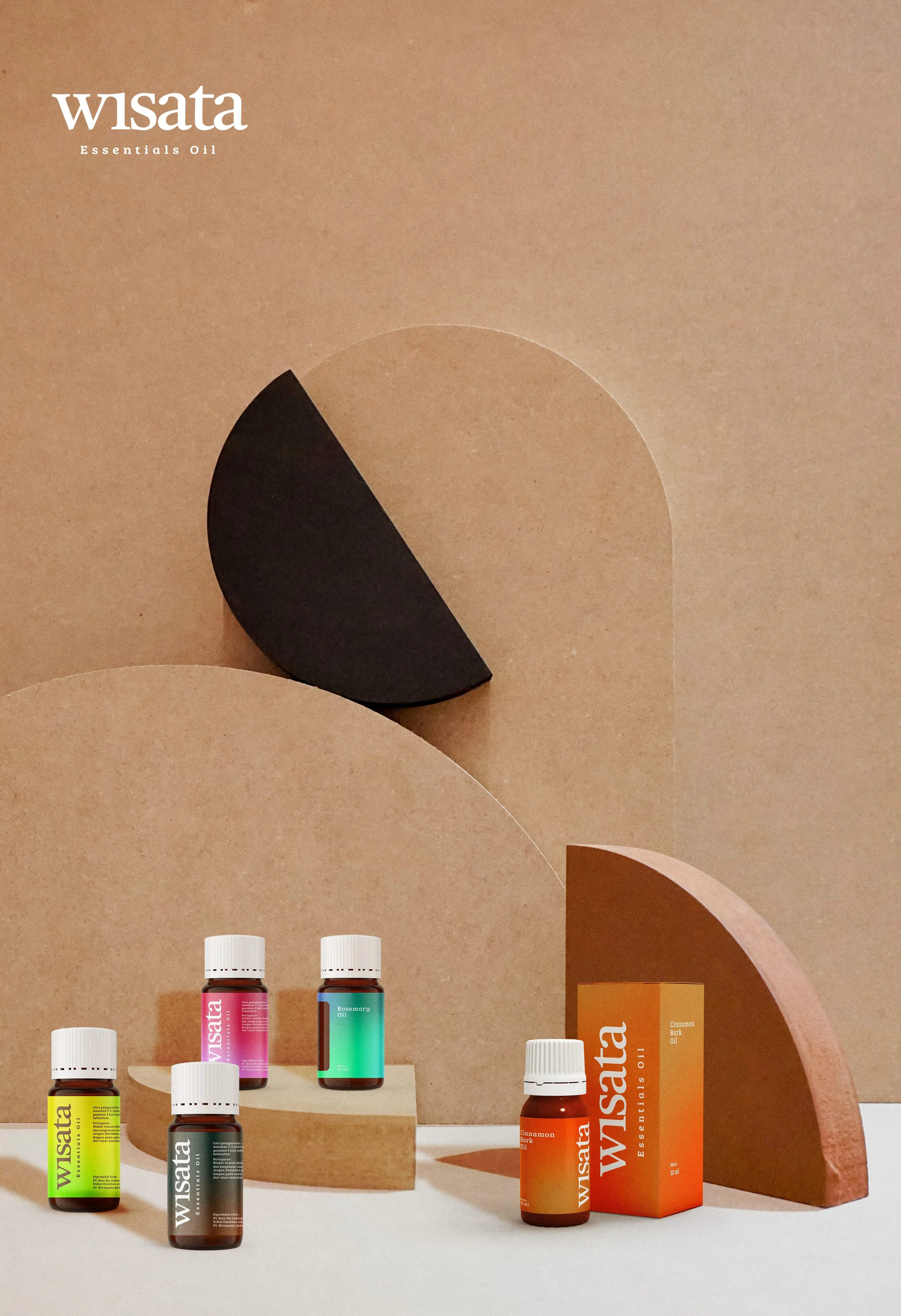
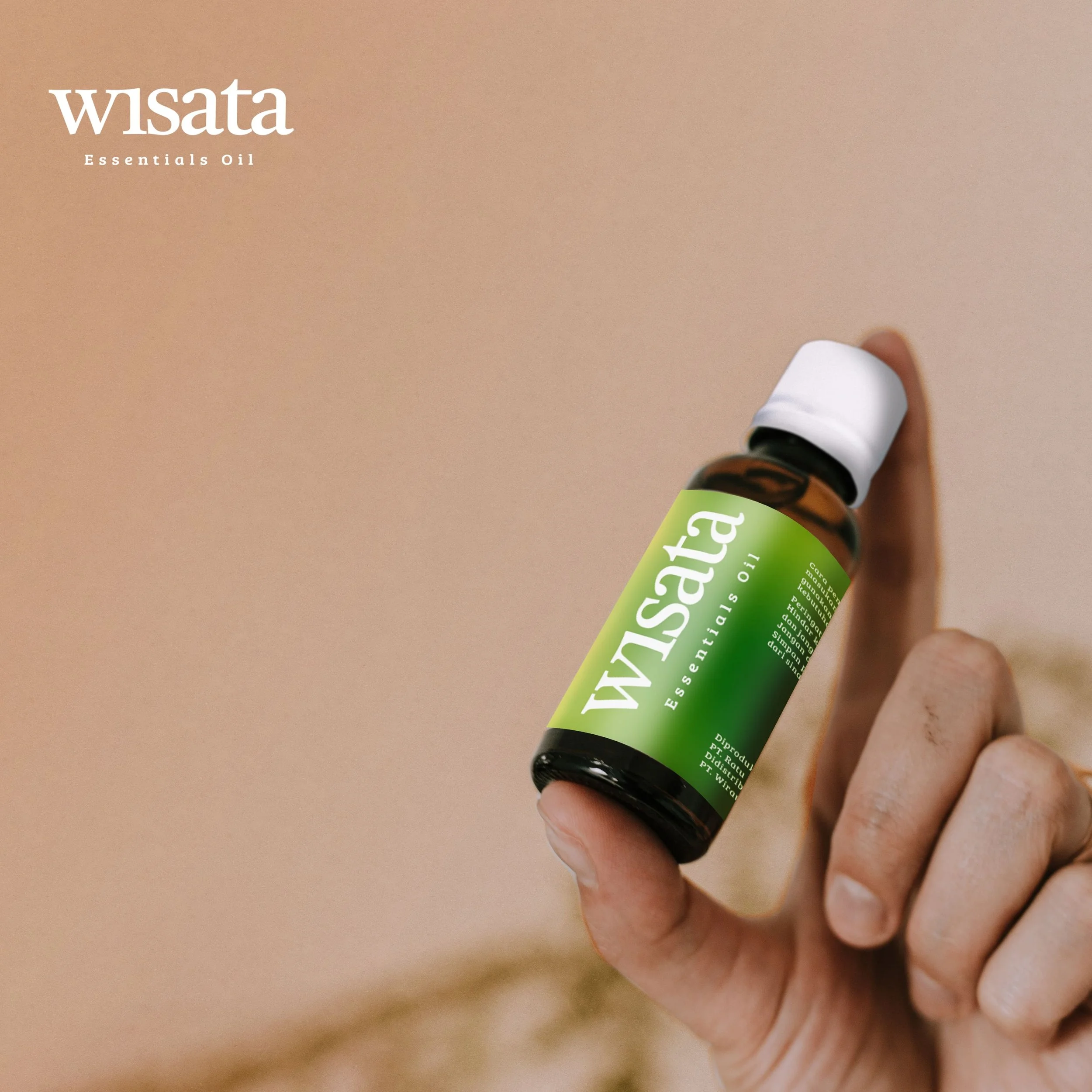
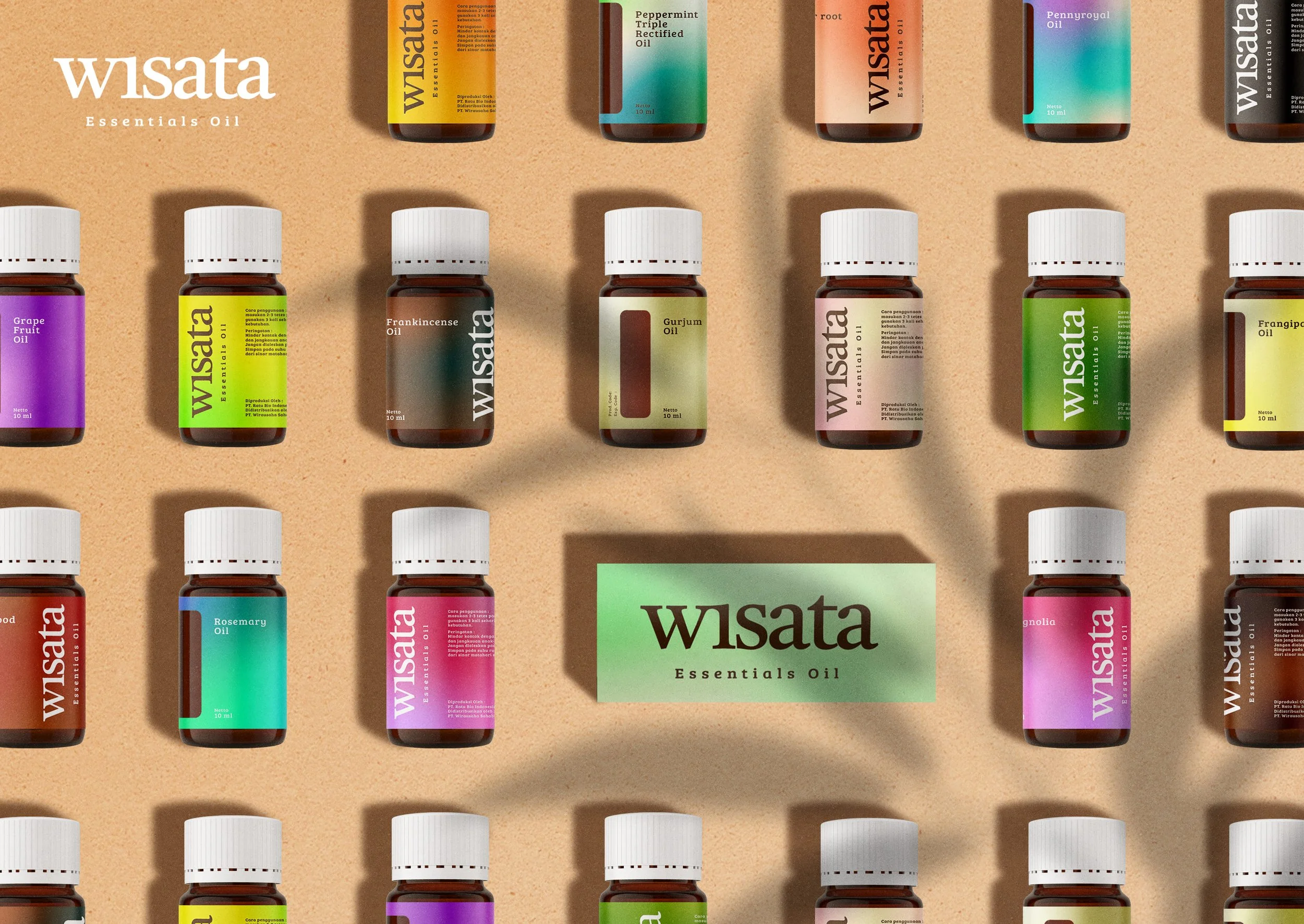
Driven by its commitment to staying relevant with evolving trends, WISATA entrusted the development of its complete product identity. The design focuses on packaging labels by clearly distinguishing each product variant.
Color becomes the primary visual language, based on the belief that every scent carries its own character and hue. Each variant is explored and translated into a distinct color expression, highlighting its uniqueness.
The goal is to create a brand that communicates intuitively without relying on explicit explanation. To align with contemporary design trends, gradient colors are applied to soften the identity while enhancing its modern and approachable character.